


Organic Since Forever
Late July was founded by Nicole Bernard Dawes, a young mom committed to pushing organic foods out of the pantry and into the party. Ptarmak was introduced to the brand through the innovation of a new product line offering traditionally cooked, stone ground corn chips featuring bold flavors.
Late July was founded by Nicole Bernard Dawes, a young mom committed to pushing organic foods out of the pantry and into the party. Ptarmak was introduced to the brand through the innovation of a new product line offering traditionally cooked, stone ground corn chips featuring bold flavors.
Late July was founded by Nicole Bernard Dawes, a young mom committed to pushing organic foods out of the pantry and into the party. Ptarmak was introduced to the brand through the innovation of a new product line offering traditionally cooked, stone ground corn chips featuring bold flavors.
Late July was founded by Nicole Bernard Dawes, a young mom committed to pushing organic foods out of the pantry and into the party. Ptarmak was introduced to the brand through the innovation of a new product line offering traditionally cooked, stone ground corn chips featuring bold flavors.
Late July was founded by Nicole Bernard Dawes, a young mom committed to pushing organic foods out of the pantry and into the party. Ptarmak was introduced to the brand through the innovation of a new product line offering traditionally cooked, stone ground corn chips featuring bold flavors.
Client
Client
Late July
Late July
Late July
Services
Services
Branding
Packaging
Copywriting
Art Direction
Line Extension
Environmental Design
Branding
Packaging
Copywriting
Art Direction
Line Extension
Environmental Design
Branding
Packaging
Copywriting
Art Direction
Line Extension
Marketing Activation
Branding
Packaging
Copywriting
Art Direction
Line Extension
Marketing Activation
Organic Since Forever
Late July was founded by Nicole Bernard Dawes, a young mom committed to pushing organic foods out of the pantry and into the party. Ptarmak was introduced to the brand through the innovation of a new product line offering traditionally cooked, stone ground corn chips featuring bold flavors.
Late July was founded by Nicole Bernard Dawes, a young mom committed to pushing organic foods out of the pantry and into the party. Ptarmak was introduced to the brand through the innovation of a new product line offering traditionally cooked, stone ground corn chips featuring bold flavors.
Late July was founded by Nicole Bernard Dawes, a young mom committed to pushing organic foods out of the pantry and into the party. Ptarmak was introduced to the brand through the innovation of a new product line offering traditionally cooked, stone ground corn chips featuring bold flavors.
Late July was founded by Nicole Bernard Dawes, a young mom committed to pushing organic foods out of the pantry and into the party. Ptarmak was introduced to the brand through the innovation of a new product line offering traditionally cooked, stone ground corn chips featuring bold flavors.
Client
Client
Late July
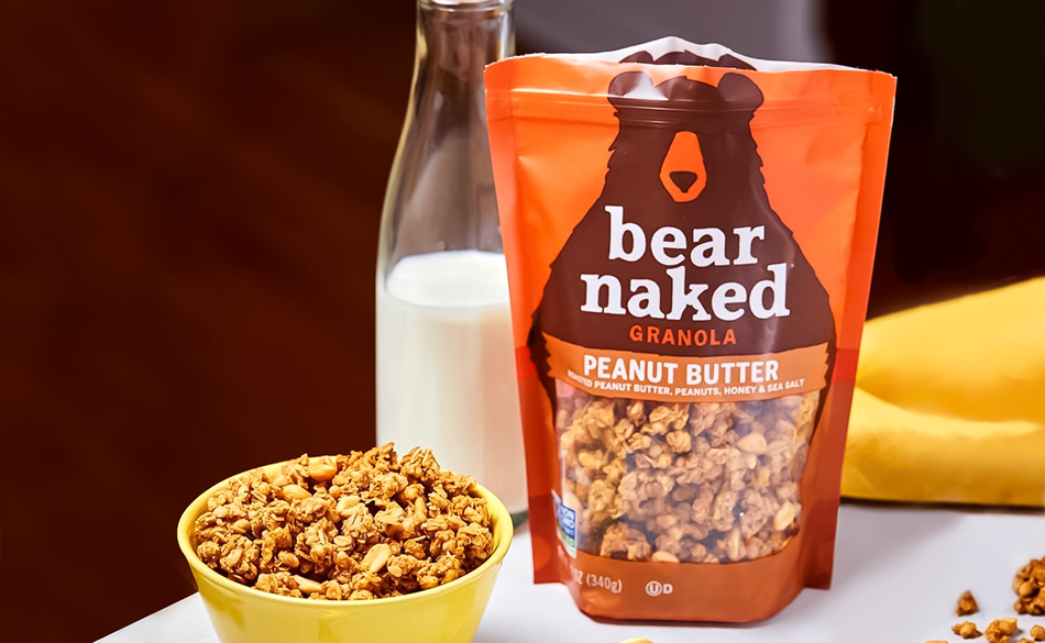
Bear Naked
Services
Services
Branding
Packaging
Copywriting
Art Direction
Line Extension
Environmental Design
Branding
Packaging
Copywriting
Art Direction
Line Extension
Marketing Activation

Challenging the Status Quo
Late July’s organic snack portfolio had already evolved beyond its seminal offering. The brand had deviated from its crackers’ heritage aesthetic with the release of their first chip line, a multigrain tortilla chip that had adopted typical design cues — packaging for the new line being developed needed to take on a personality of its own by ramping up taste appeal and showcasing its unique personality & flavors. It also needed to establish some rules for consistency of the brand’s visual identity going forward.
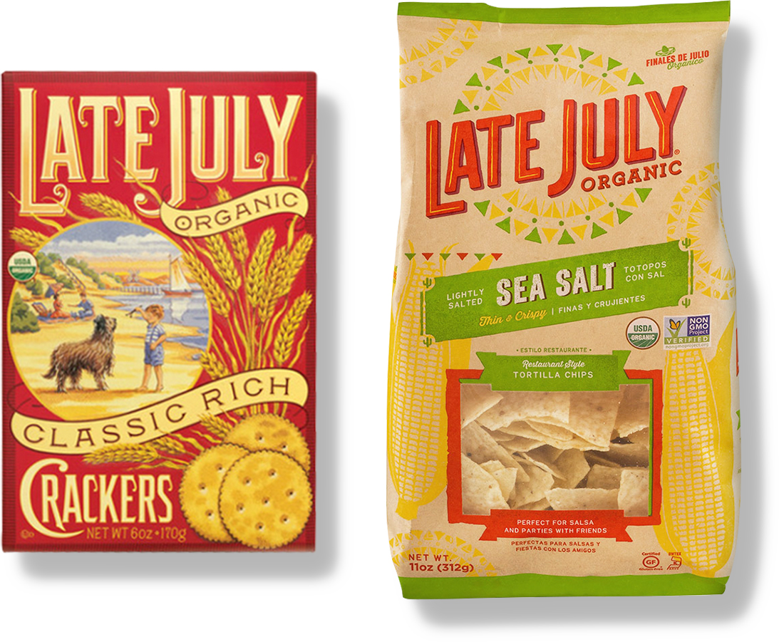
BEFORE
AFTER
BEFORE
AFTER

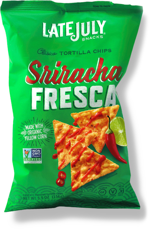
The New Foodie
With the growing popularity of food truck culture amongst young foodies, Late July saw an opportunity to speak to a different demographic. The new line needed to appeal to younger millennials looking for more novel flavors without polarizing existing Late July consumers.
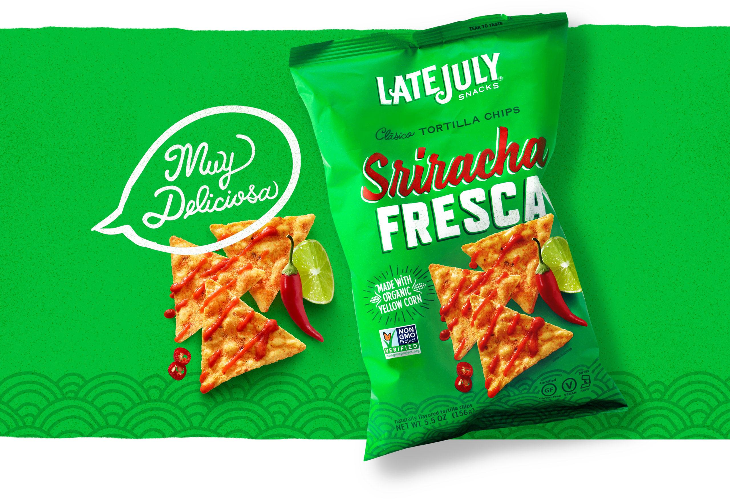
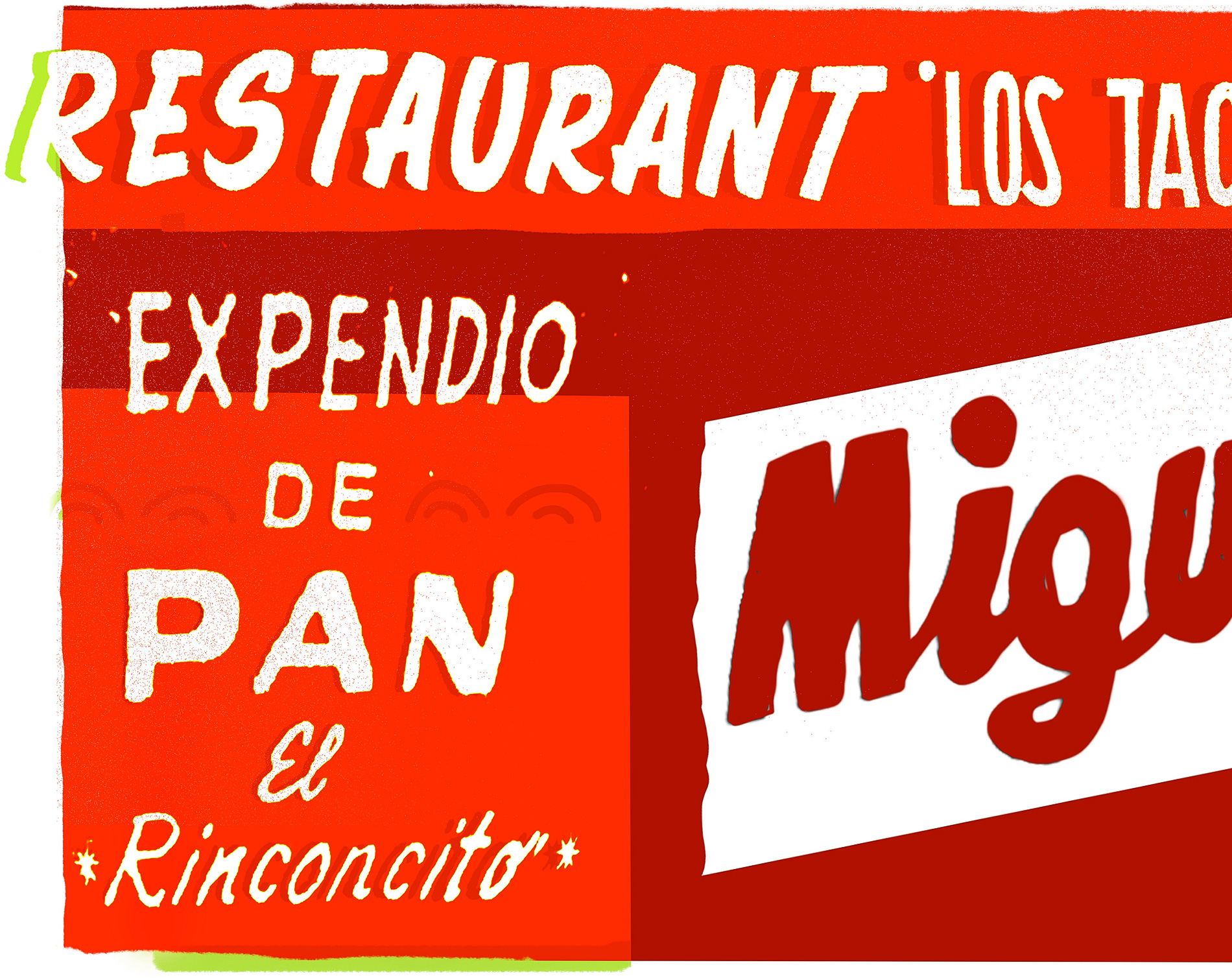
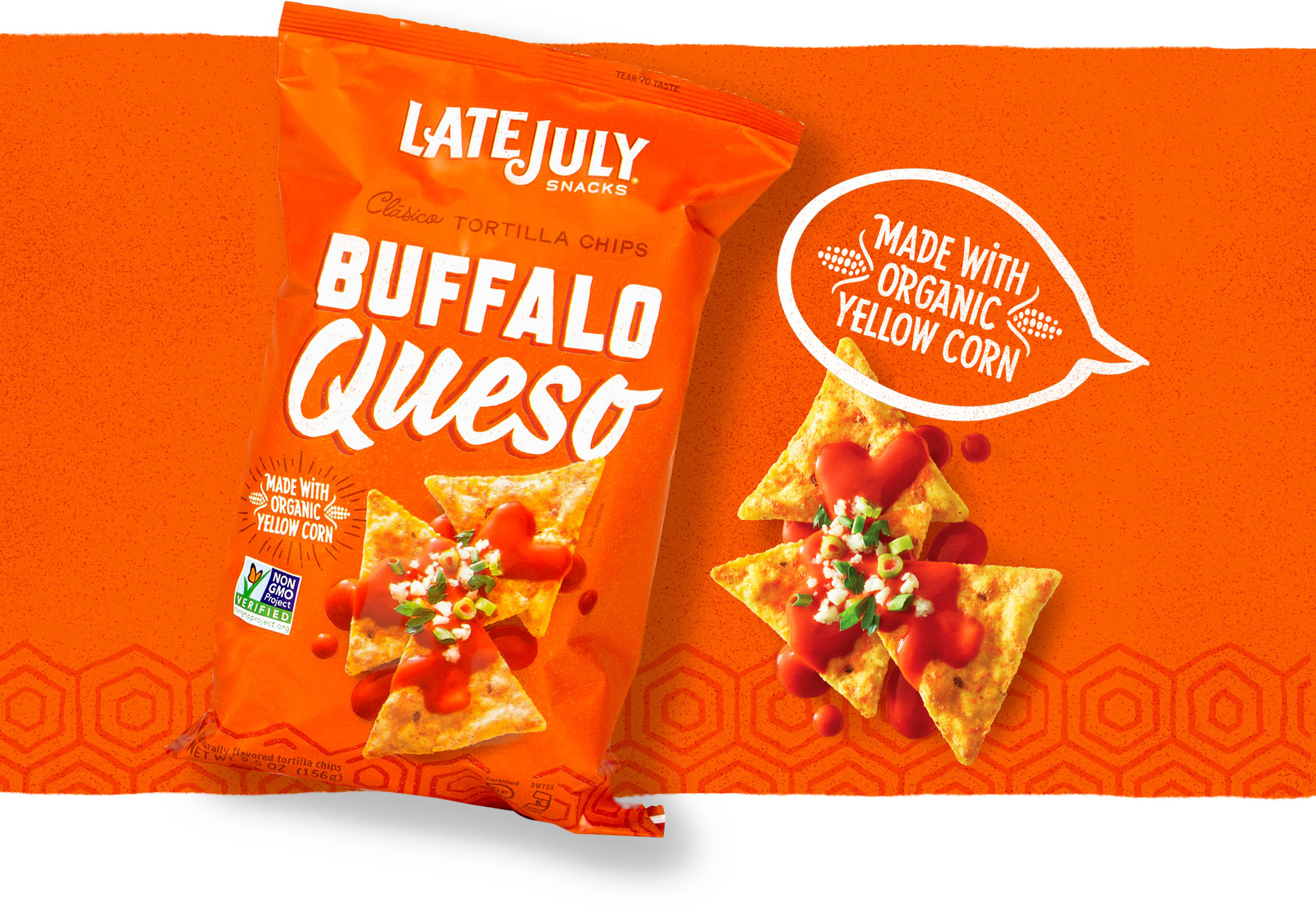
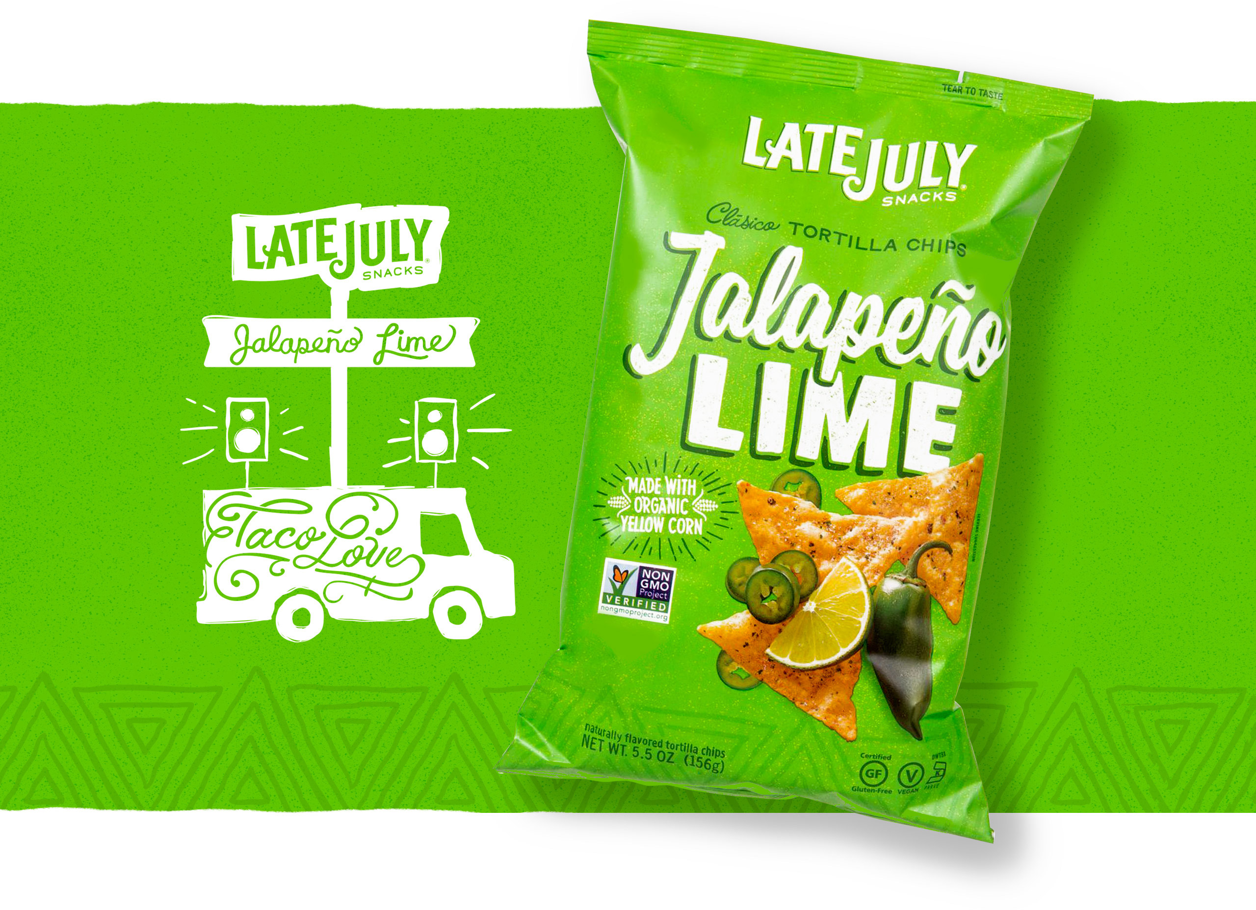
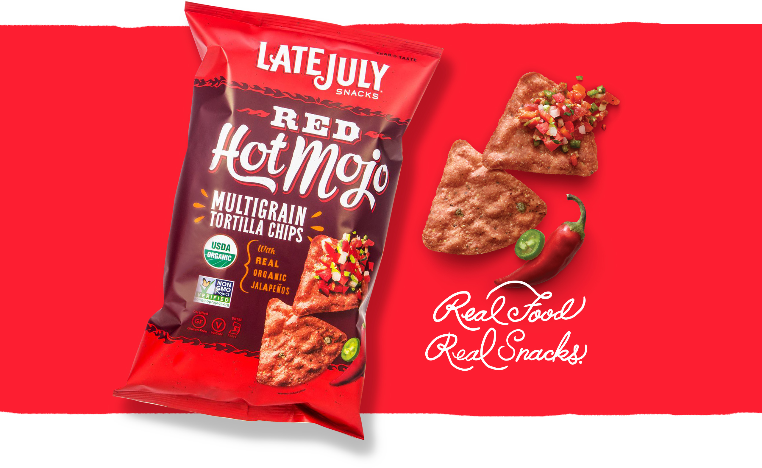
Viva Los Clasicos
Typography across what became known as the Clasicos Line was inspired by traditional Mexican street art and sign painting. Shadowy dimensional effects, stucco texture, and a variety of hand-drawn scripts are used across flavor names and callouts.
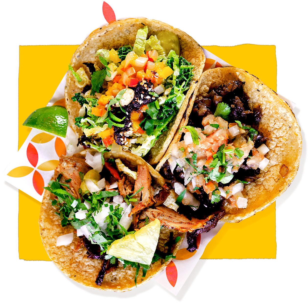
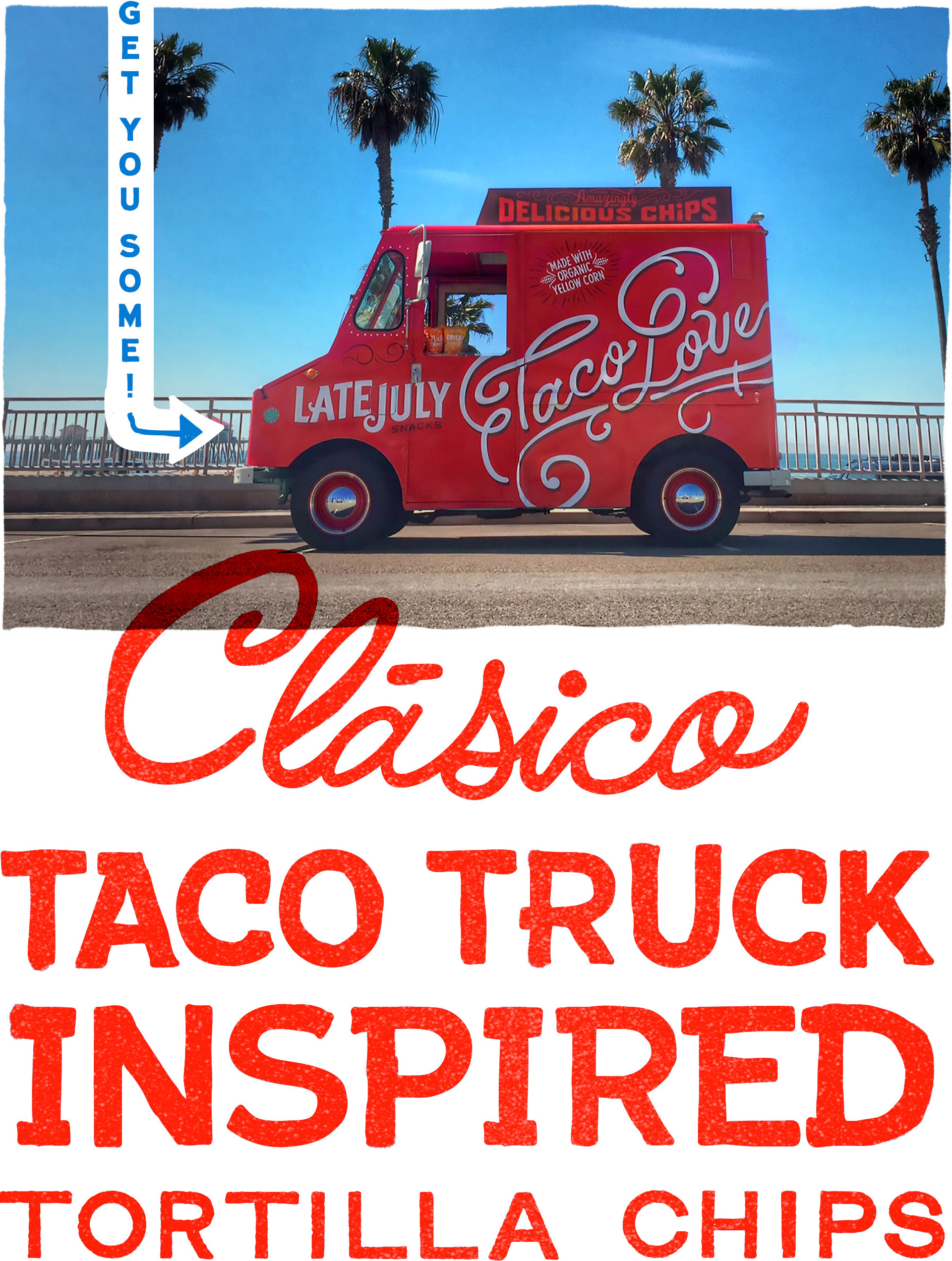
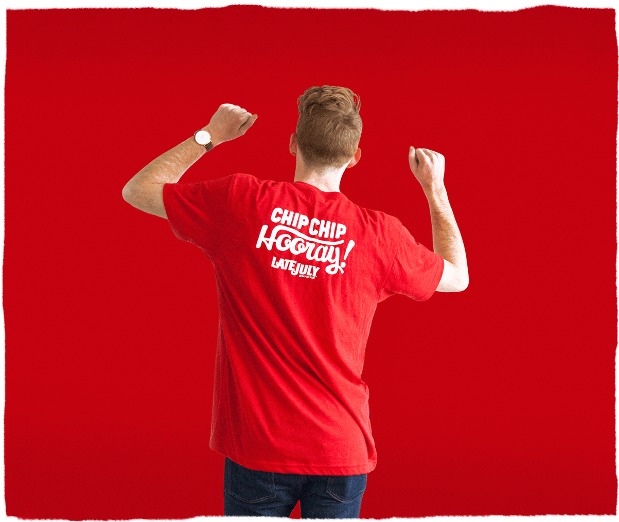
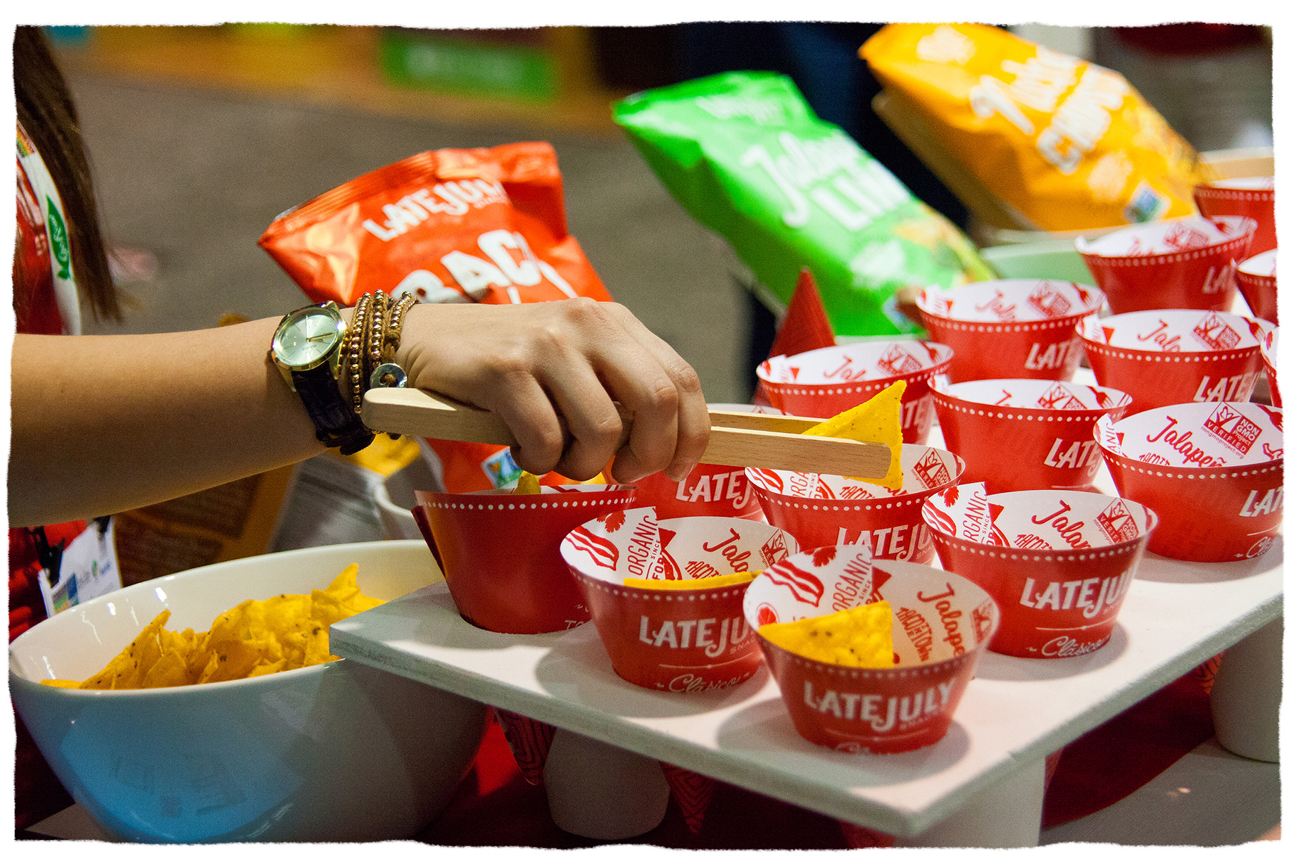
Taco Love
Our taco truck inspiration came full circle when the line launched. As part of a marketing activation campaign, we designed a — you guessed it — taco truck. The Late July truck toured the country sampling their delicious new chips and spreading lots of taco love.
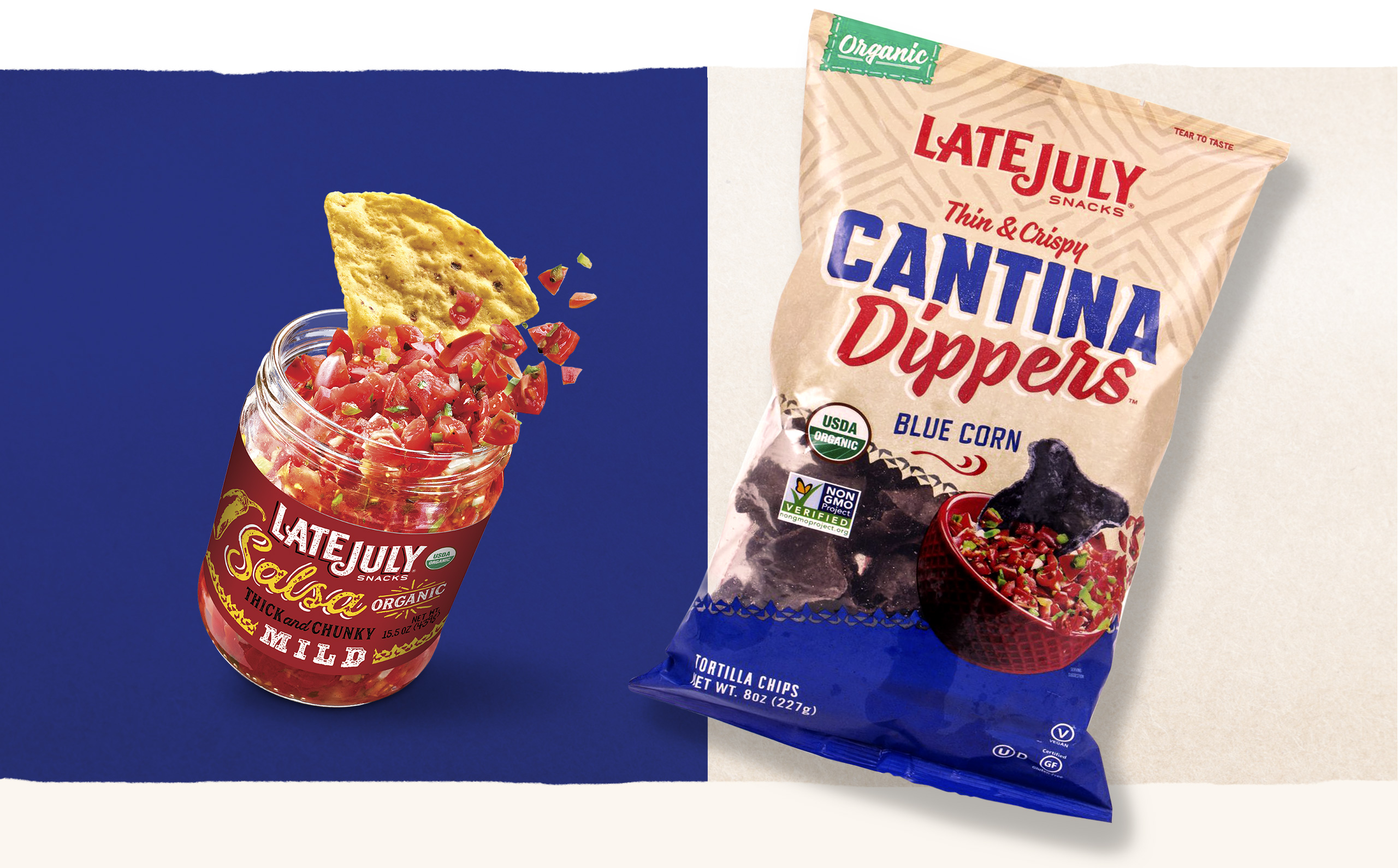
Taco the Town
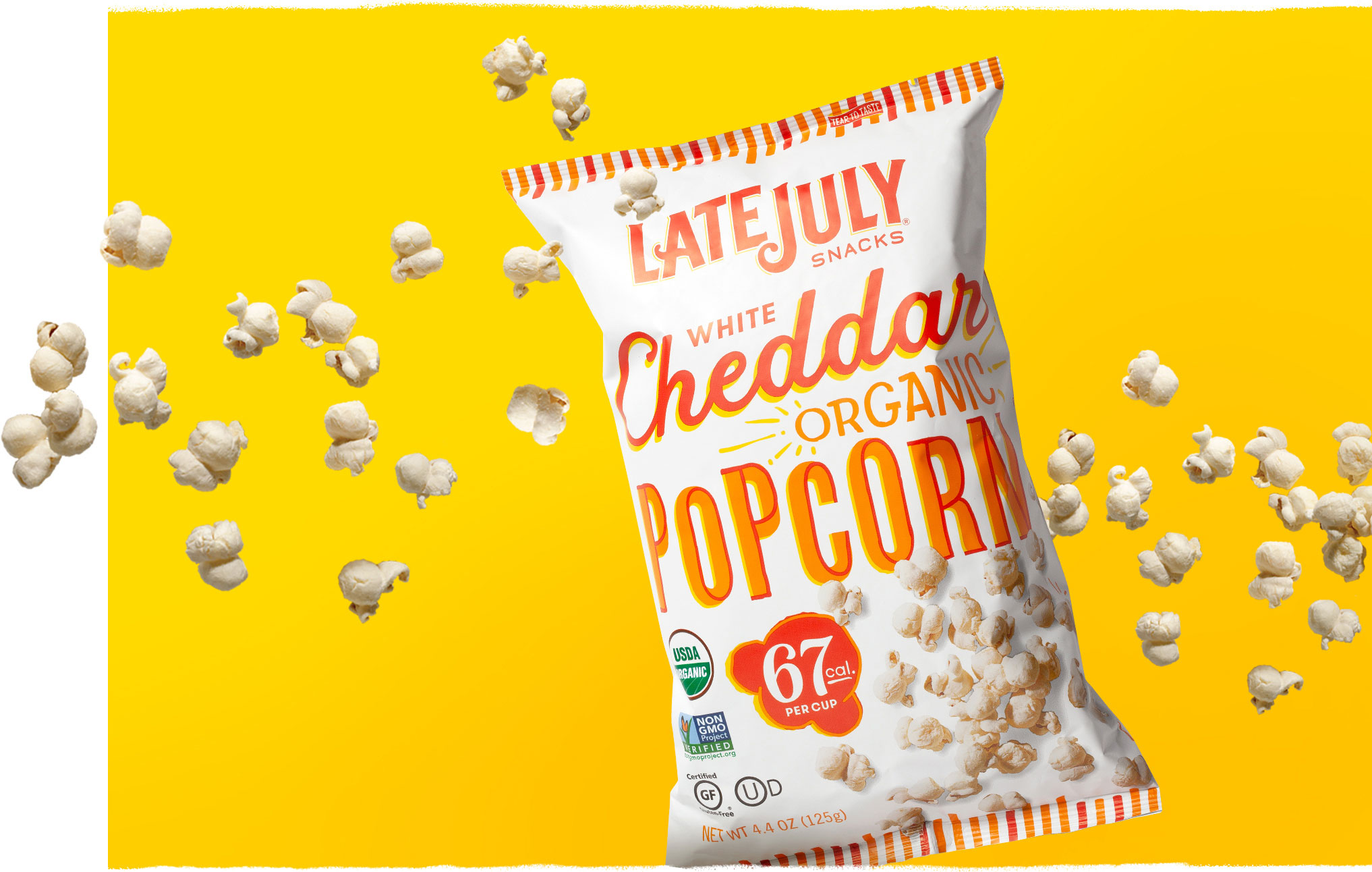
The Clasicos product launch was so successful, and reception of the taco truck packaging so positive, that we were asked to reinvent the brand’s Multigrain line and extend our design thinking to all future innovation: Restaurant Style, Cantina Dippers, and Popcorn. The bold yet inviting type combinations provide enough versatility for each product line to flex its own personality, while the consistent placement of info and overall signature aesthetic ensures the entire snack portfolio hangs together cohesively.
Taco the Town
The Clasicos product launch was so successful, and reception of the taco truck packaging so positive, that we were asked to reinvent the brand’s Multigrain line and extend our design thinking to all future innovation: Restaurant Style, Cantina Dippers, and Popcorn. The bold yet inviting type combinations provide enough versatility for each product line to flex its own personality, while the consistent placement of info and overall signature aesthetic ensures the entire snack portfolio hangs together cohesively.


We build brands
folks taco bout.
We build brands
folks taco bout.
We build brands
folks taco bout.
We build brands
folks taco bout.
We build brands
folks taco bout.
Suggested Projects
Let's Start
Something.
Let's Start
Something.
Let's Start
Something.
Let's Start
Something.
©Ptarmak, Inc. 2007-2025
©Ptarmak, Inc. 2007-2021
